Room Paint Visualizer: Work With the Furniture You Have
A paint colour can look convincing in a sample room and completely wrong beside your own sofa. Often, the difficulty isn't choosing a pleasing colour. It's finding one that works with the furniture, flooring and everyday belongings that will remain after the decorating is finished.
A room paint visualizer is useful for this problem. Rather than imagining an empty room, you can test how different wall colours affect the room you already live in. That makes it particularly helpful for renters, owners updating one room at a time, and anyone whose budget covers paint but not replacement furniture.
The most useful question is: “What makes the things I'm keeping work better together?”
What Determines the Work and Expense?
The preview is usually a small part of the project. Wall condition, ceiling height, colour changes, furniture handling and the number of surfaces being painted drive the actual work.
Keeping sound trim and ceilings unchanged can contain costs, provided the new wall colour suits them.
| Detail | Practical expectation |
|---|---|
| Best for | Updating occupied rooms while keeping major furnishings |
| Budget range | Low for digital testing; moderate to high for preparation and painting |
| Difficulty | Straightforward previews; more judgement needed with mixed finishes |
| Time | About an hour for initial comparisons, then several days to assess samples |
| Maintenance | No ongoing tool upkeep; painted walls need care suited to their finish |
Understand What the Preview Represents
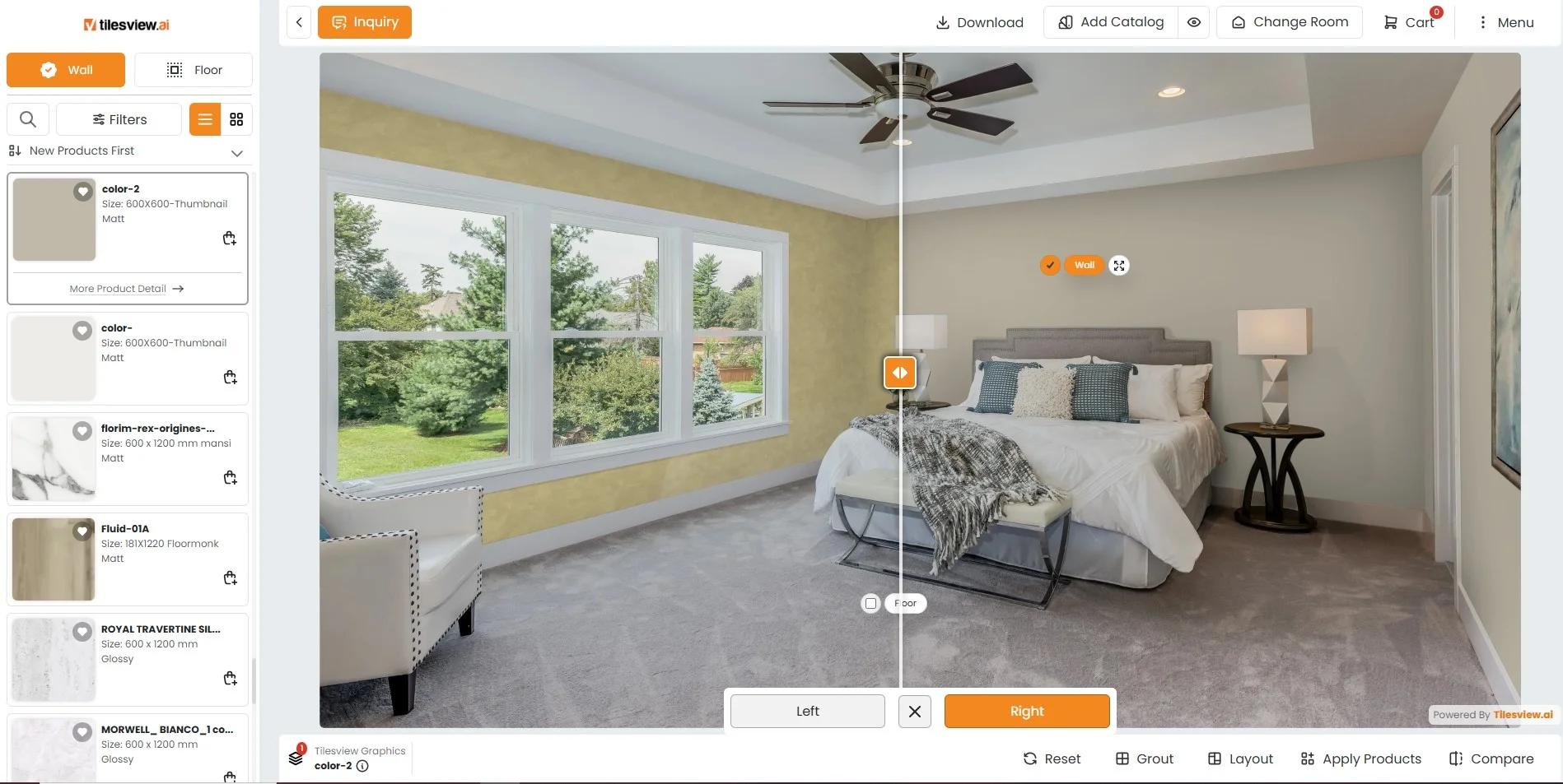
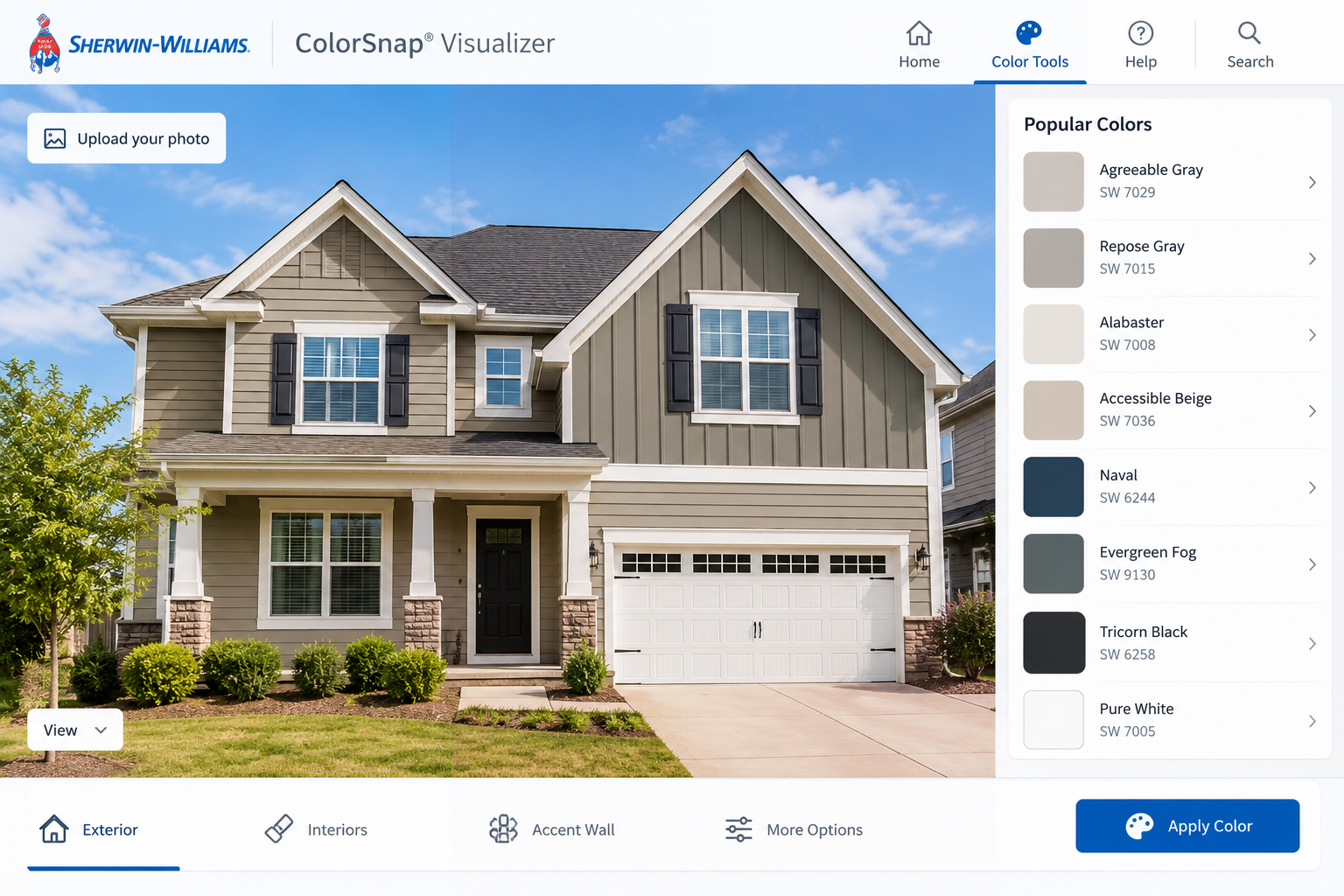
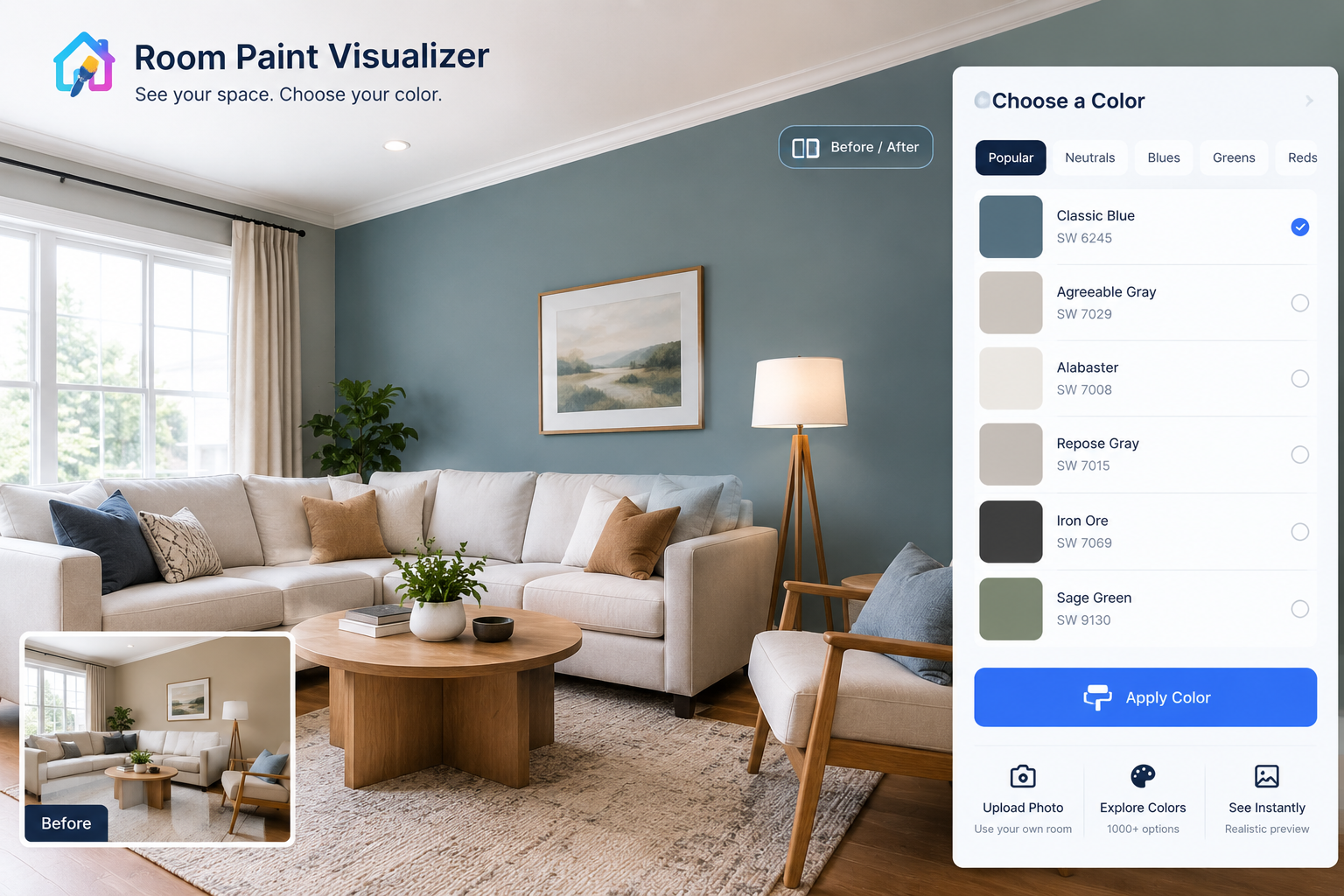
A room paint visualizer applies a simulated colour to selected areas of a photograph or model room. Some tools identify walls automatically; others require you to mark the boundaries yourself.
The important distinction is between colour comparison and colour matching. A preview can help you decide whether a muted green works better than a warm neutral. It cannot reliably show the exact appearance of a particular paint on your wall.
Camera processing, screen settings, lighting and surface texture all influence what you see.
Build the Test Around What Is Staying
1. Identify the room's least flexible elements
List the pieces you cannot reasonably change: flooring, a large sofa, fitted cabinets, curtains or a substantial rug. Start with the most visually dominant items, not the smallest decorative accessory.
Notice their undertones—the subtle colour beneath the obvious colour. A grey sofa may lean blue or violet; a pale floor may look pink, yellow or grey. You don't need to name every undertone perfectly. You need to recognise which proposed wall colours make those materials look uncomfortable.
Include the existing trim white. A creamy white can look noticeably yellow beside a cool wall colour.
2. Photograph an ordinary, usable room
Tidy temporary clutter, but leave the main furnishings in place. Include enough floor, trim and furniture for the wall colour to have context.
Take one image towards the main seating area and another from the doorway. In an open-plan home, add a view showing the adjoining space. Avoid ultra-wide camera settings that exaggerate the room's proportions.
Use even daylight without strong sun patches for the main comparison. Switch off filters and avoid changing photo adjustments between tests.
3. Compare three different directions
Try a light neutral, a mid-tone colour and a deeper option within a palette that suits the retained finishes. This reveals more than comparing six nearly identical off-whites immediately.
Judge each version against specific questions:
- Does the sofa look more settled or more conspicuous?
- Is the floor's warmth attractive, or suddenly excessive?
- Do cabinets and door frames feel connected to the room?
- Is the contrast comfortable from the doorway?
Then narrow the preferred direction to two or three actual paint colours for physical sampling.
4. Account for small spaces, rentals and local conditions
In a small room, assess how colour affects contrast rather than assuming that white is mandatory. A deeper wall can make a dark bookcase less prominent; a very pale wall may outline every object sharply.
Renters should confirm permission, permitted surfaces and any requirement to restore the original colour before buying paint. Removable painted sample boards are useful, but check before using adhesives on existing finishes.
Climate affects the painting work more than the digital test. High humidity can slow drying, while extreme heat can cause application problems. Follow the product's temperature, humidity and ventilation guidance. Dampness needs investigation, not a more flattering preview.
Choose the Level of Help You Need
An uploaded room photograph
This is generally the most relevant starting point when existing furniture matters. It preserves the relationships between your finishes, though automated wall selection may miss narrow sections or colour over curtains.
Check the edges before judging the result. A mistakenly recoloured sofa can make a scheme appear coordinated when it isn't.
A furnished sample room
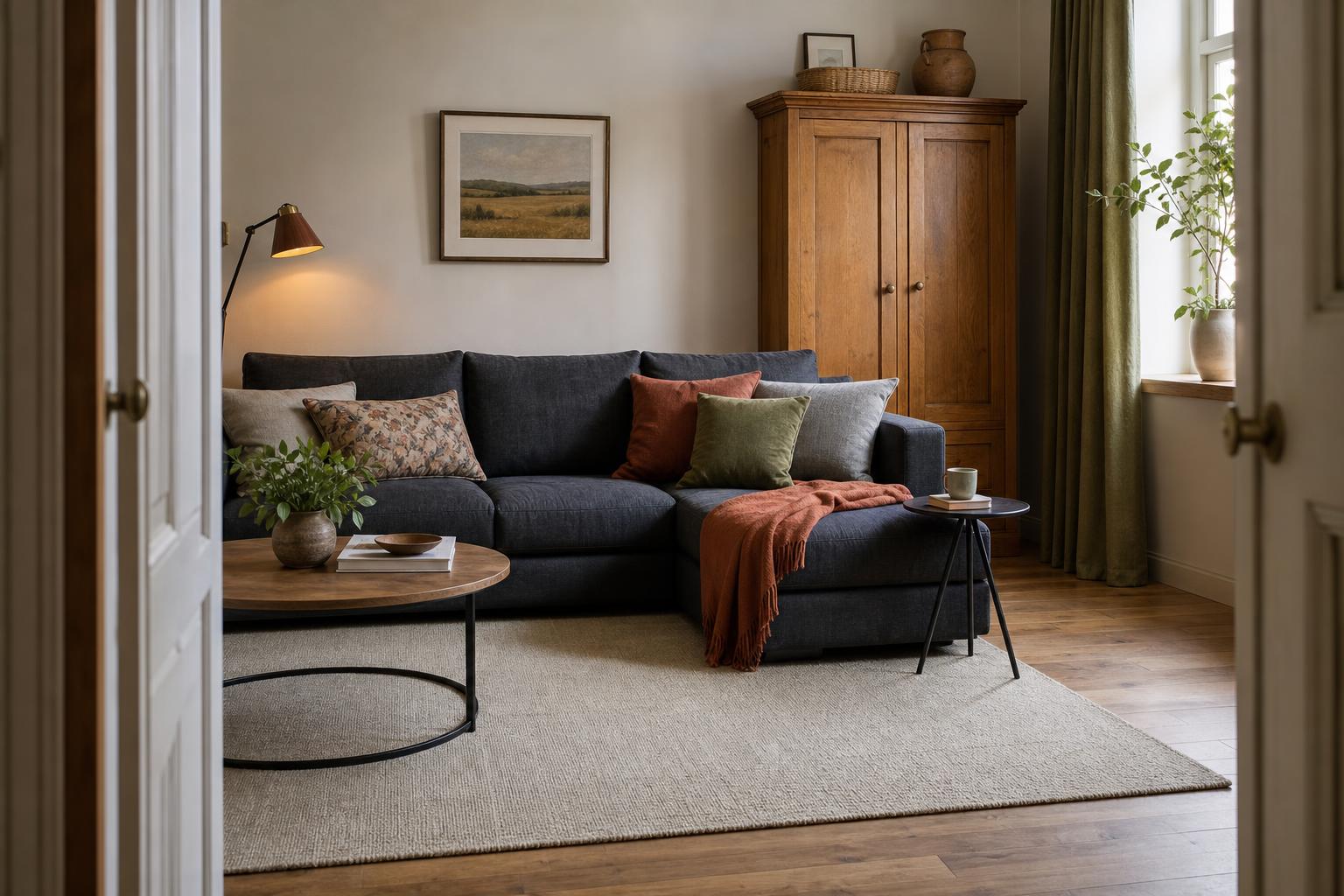
A stock room is quick and useful for exploring broad colour preferences. However, its flooring, light and furnishings may bear little resemblance to yours. Treat it as a first filter, not evidence that a colour will work at home.
A colour consultation or decorator's assessment
Professional advice becomes more valuable when several fixed finishes compete, rooms connect awkwardly, or repainting would be expensive. A colour adviser can help resolve the palette; a decorator can assess preparation and access requirements. These are related but different services.
Pair Wall Colour With Materials, Not Just Accessories
Paint works best when it acknowledges the room's large colour areas. Oak flooring, for example, can suit warm whites, softened greens and some blue-greens, but the particular wood tone matters. Strong yellow-orange timber behaves differently from pale, relatively neutral oak.
Cool grey upholstery may work with balanced off-whites or muted blues. Putting it against a strongly yellow cream can exaggerate its coolness. That contrast isn't automatically wrong, but it should be intentional.
For patterned rugs or curtains, consider a quieter background colour rather than automatically copying the brightest accent. Large walls amplify a colour's presence.
Be cautious about matching walls exactly to a sofa. Fabric changes with pile direction and light, while paint reflects light differently. A clear, considered difference often looks better than an almost-match.
Check connected rooms together. They don't need identical paint, but abrupt changes in warmth or contrast can make a short hallway feel disconnected from the spaces it joins.
Avoid Decisions That Quietly Expand the Budget
A convincing preview can encourage additional work that wasn't in the original plan. Changing the trim may expose tired doors; repainting the ceiling adds protection, access and labour.
Before approving a scheme, write down which surfaces remain untouched. Then check that the visualizer hasn't altered them accidentally.
Other avoidable expenses include:
- Buying full quantities before testing the actual product.
- Assuming a pale colour will cover a dark wall in one coat.
- Selecting a specialist finish without checking application requirements.
- Forgetting furniture moving, repairs and waste allowances.
Calculate paint quantities from measured surface areas and the manufacturer's coverage information, allowing for the recommended coats. A photograph is not a reliable measuring tool.
Know the Tool's Practical Limits
A preview cannot diagnose peeling paint, moisture damage or an unsuitable substrate. Gloss, texture and uneven surfaces can also behave very differently from the smooth finish shown onscreen.
Avoid disturbing old coatings if hazardous materials may be present. Arrange assessment and any necessary remediation through appropriately qualified or licensed professionals under local requirements.
Before uploading photographs, check the service's privacy and image-retention terms. Remove visible addresses, family photographs and other personal details where practical.
Screen comfort settings that warm the display can distort comparisons. Disable them for testing, but remember that a neutral-looking screen still isn't a paint sample.
When Digital Recolouring Is a Poor Fit
A visualizer offers less value when the main issue is inadequate lighting, an uncomfortable furniture layout or deteriorating walls. Paint may help the appearance without solving the problem.
It is also less dependable for reflective finishes, limewash effects, heavily textured plaster and rooms lit mainly by coloured glazing or decorative LEDs. Physical samples carry more weight in these situations.
If you're considering removing walls or altering electrical lighting, use appropriate design advice and licensed trades rather than treating a colour preview as a renovation plan.
Plan for Cleaning and Later Touch-Ups
Once you've selected the colour direction, choose a product and sheen suited to the room's use. Washable matt finishes can suit living spaces; more demanding areas may need a finish specifically rated for repeated cleaning or moisture exposure.
Higher sheen often makes surface defects more noticeable. Compare finish samples as well as colours where practical.
Keep the colour reference, product name, sheen and purchase date. Retain some labelled paint according to the manufacturer's storage instructions. Touch-ups can still show, especially on aged or higher-sheen surfaces, so repainting a complete wall may eventually give a better result.
Put the Budget Where It Reduces Risk
A low-budget approach uses a free or included preview service, a small shortlist of samples and careful DIY preparation. The saving depends on having sound walls and the time and ability to paint safely.
A mid-range approach adds paid advice or professional help with repairs and difficult areas. It can make sense when choosing colour is straightforward but achieving a tidy finish isn't.
A higher-budget approach includes professional preparation and painting, potentially across connected rooms, trim and ceilings. Labour, access and substrate repairs usually matter more than the visualizer fee.
Compare local quotes on the same written scope: surfaces, preparation, products, coats, protection and cleanup. Reserve some money for defects discovered during preparation rather than spending the full allowance on paint alone.
Questions Before You Commit to a Colour
Can a room paint visualizer work with a furnished room?
Yes. Keeping furniture visible helps you judge relationships. Check that automatic selection hasn't painted over upholstery or artwork.
Is a phone photograph good enough?
Usually, for initial comparisons. Use a sharp, evenly lit image without filters, strong glare or exaggerated wide-angle distortion.
Will the colour on my screen match the finished wall?
Not reliably. Use the screen to shortlist colours, then test the specified paint in your room.
How many colours should I compare?
Start with three distinct directions. Narrow these to two or three physical samples rather than collecting dozens of similar options.
Should I remove artwork before taking the photograph?
Leave it if it will stay. Remove it if you need to inspect the full wall, then assess the colour with it reinstated.
Can I test an accent wall?
Yes. Include neighbouring walls in the image so you can judge the corner transitions and overall balance.
What if the room looks different at night?
Assess physical samples under the lamps you normally use. A daylight photograph cannot represent every evening lighting condition.
Should adjoining rooms use the same colour?
Not necessarily. Related undertones and deliberate contrast can connect different colours without making every room identical.
Can the tool choose the right paint finish?
It may illustrate finishes, but don't rely on simulated sheen. Select for cleaning needs, wall condition and manufacturer guidance.
How long should I assess samples?
Allow them to dry as directed, then view them across several days and at different times before deciding.
Let the Existing Room Guide the Choice
The strongest use of a room paint visualizer is to test relationships: wall against floor, sofa against background, one room against the next. Confirm the result with real paint before committing.
If you'd like to explore those relationships further, the DecorAdTechadvice redesign tool offers a next step for considering paint alongside the room's broader design.