| Planning point | What to expect |
|---|---|
| Best for | Comparing colour directions and deciding which surfaces to paint |
| Budget range | Low for previews and samples; higher for advice, preparation and labour |
| Difficulty | Easy with clear photos; moderate around trim and complex edges |
| Time | Around 30–60 minutes for an initial comparison; several days for sample checks |
| Maintenance | Save colour records; maintain the actual paint according to its product guidance |
- Photograph the whole relationship. Include flooring, trim and a meaningful section of furniture. An empty wall gives little context for judging colour.
- Use even, representative light. Avoid direct sun patches, flash and heavily filtered images. Take a second photograph under your usual evening lighting rather than expecting one image to describe the entire day.
- Keep the camera reasonably level. A straightforward view makes edges easier to select. Include another angle if the room has recesses or an open-plan connection.
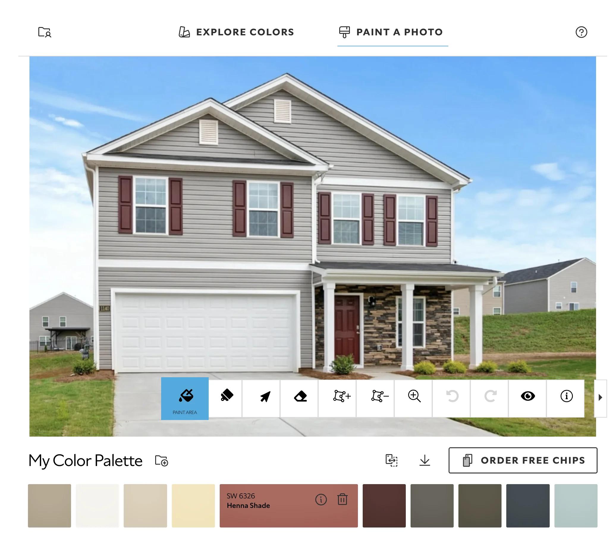
- Check every painted boundary. Correct colour spilling onto curtains, artwork, ceilings or window glass. Poor masking can make a workable scheme look clumsy.
- Compare a small set. Start with three genuinely different directions, then refine the strongest one. Keep the photograph, lighting and screen settings consistent between comparisons.
- Save useful records. Label each image with the manufacturer, colour name, code and intended surface. A screenshot alone is not a dependable paint specification.
- Low: A free visualizer, a small shortlist of samples and reusable boards. Best for one room with sound surfaces and a clear brief.
- Mid: Paid editing or a focused colour consultation, more sample testing, and suitable preparation materials. Useful when rooms connect or fixed finishes are difficult to coordinate.
- High: Whole-home colour advice and professional painting involving extensive repairs, ceilings, joinery or difficult access. Labour and preparation generally dominate this scope.
Home Painting Visualizer: Choose Colours Before You Paint
What Determines the Cost and Scope?
What a Visualizer Can—and Cannot—Show
Set the Brief Before Uploading a Photograph
Decide what will stay
Establish rental boundaries
Account for space and climate
Ring-fence the sampling budget
Build a Preview You Can Actually Trust
Choose the Right Type of Preview
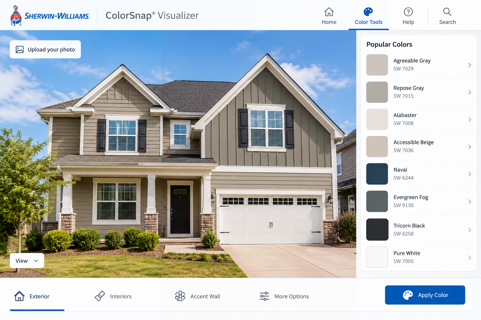
Manufacturer-linked visualizers
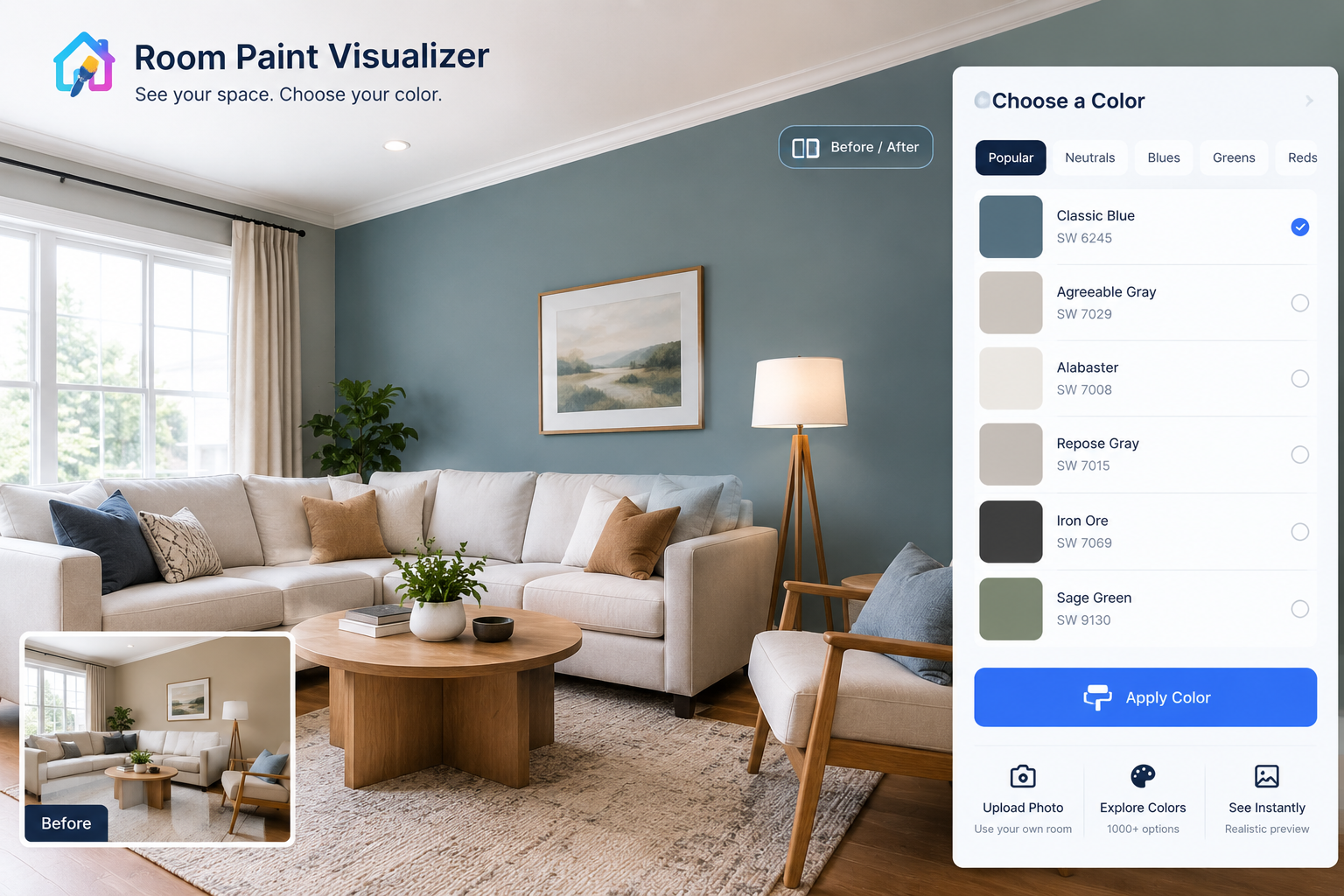
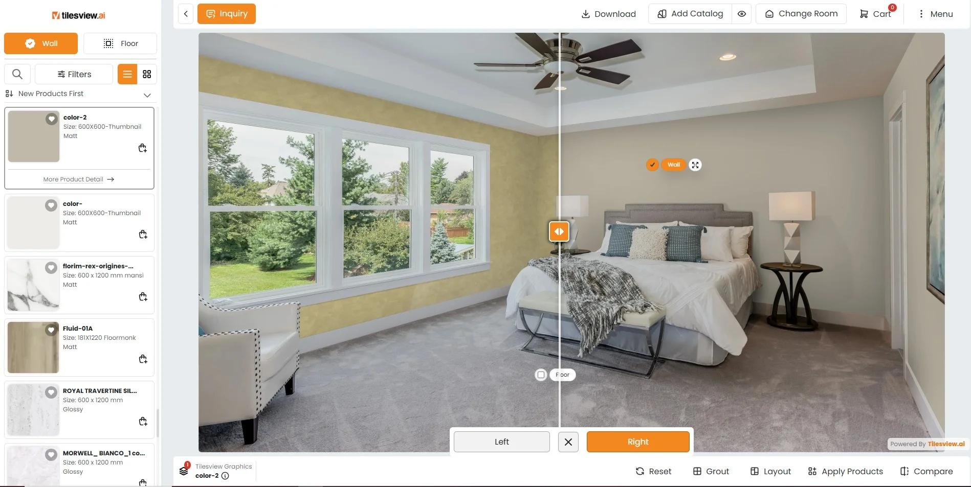
General room-editing and AI tools
Professional colour advice
Pair Wall Colour with the Finishes That Matter
Turn the Shortlist into Physical Tests
Budget for Paintwork, Not Just the App
Avoid Scope Changes Hidden Inside a Colour Decision
Check Safety and Privacy Before Proceeding
When a Visualizer Is a Poor Fit
Keep a Paint Record for Later Maintenance
Questions Before You Commit to a Colour
Is a home painting visualizer accurate?
Can I use a photograph from my phone?
Are free tools good enough?
Can a visualizer identify my existing paint?
Should I test the ceiling too?
Will a dark colour make my room smaller?
Can the preview show washable paint?
How many colours should I sample?
Should I send the preview to my painter?
Can I use the same colour throughout my home?
Let the Preview Narrow the Decision
Related reading
A paint colour can look reassuring on a small card and surprisingly wrong across four walls. A home painting visualizer helps bridge that gap: upload a room photograph, apply colours digitally, and compare the effect before buying paint.
It is useful for homeowners weighing a full repaint, renters seeking approval for a modest change, and anyone struggling to picture a stronger colour. But the preview is not a colour guarantee. Cameras, screens, lighting and software all influence what you see.
The best use of the tool is to narrow your options. The final decision still belongs in the room, with real paint samples.
Digital previews are often free; costs rise when you add paid editing, colour advice or professional painting. The physical job depends mainly on surface condition, painted area, access, preparation and the coating system—not the number of colours you test onscreen.
Most tools identify a wall or let you mark its boundaries, then place a digital colour over it. This selection is sometimes called a mask. Better previews retain some of the original shadows so the wall still looks three-dimensional.
A visualizer can show whether darker walls balance a bright sofa, whether a painted ceiling feels appropriate, or whether contrasting trim makes a room look too busy. It cannot reliably reproduce texture, coverage, sheen or the exact appearance of a dried coating.
Two useful terms are undertone, the subtle colour bias within a neutral, and light reflectance value, or LRV, a measure of how much visible light a surface reflects. Higher-LRV colours generally reflect more light, but a pale paint cannot compensate for inadequate lighting. Check manufacturer data rather than estimating LRV from a preview.
List the fixed elements: flooring, worktops, tiles, window frames and large furniture you intend to keep. These matter more than an isolated favourite paint shade.
Choose a specific goal. You might want to soften the contrast with dark flooring, reduce a yellow cast beside white cabinets, or make adjoining rooms feel connected. A clear aim prevents an afternoon of attractive but irrelevant previews.
Check the tenancy agreement and obtain written permission where required. Confirm permitted surfaces, acceptable colours and any obligation to restore the original finish.
A visualizer can help explain a proposal to a landlord, but the image is not approval. Keep the agreed colour reference and scope in writing. For removable sample boards, check that any adhesive will not damage the existing coating.
In a small room, test the relationship between walls, ceiling and trim rather than assuming everything must be white. Similar colours can reduce visible boundaries; strong contrast draws attention to them. Neither approach guarantees that a room will feel larger.
Climate affects the physical work. High humidity can slow drying, while intense sun and excessive heat can affect application. Follow the product's temperature and humidity limits. In persistently damp rooms, investigate moisture before choosing a finish.
Reserve money for physical testing before pricing the main paint order. Three carefully selected samples usually tell you more than twelve nearly identical ones. Keep a separate allowance for repairs, primer and tools so colour selection does not consume the preparation budget.
Disable night-mode colour shifts when comparing previews, and avoid judging them on a screen turned unusually bright. This reduces obvious distortion but does not make the display colour-accurate.
If the software replaces furniture, changes window light or smooths away wall defects, treat the result as an impression rather than a faithful repaint simulation. A persuasive image can still describe a room you do not have.
These usually connect digital colours to an identifiable paint range, making it easier to order samples. They suit straightforward comparisons when you already know which products are locally available.
The limitation is choice: the palette may be restricted to one supplier. Availability and colour naming can also differ between markets, so confirm the local reference.
These offer more freedom to explore colour families or coordinate paint with furnishings. They are useful early in a project, particularly when you have not settled on a palette.
Their weakness is specification. A generated sage wall may not correspond to a purchasable paint colour, and the tool may alter lighting or materials. Use the image to identify a direction, then find real samples.
A colour consultant or interior designer can assess transitions, fixed finishes and lighting that a single photograph misses. This is worth considering for connected rooms, expensive joinery or a costly exterior repaint.
Ask what the service includes: site assessment, product references, sample review and written schedules are not automatically part of every package.
Start with the least changeable surfaces. Flooring, stone and cabinetry usually cost more to replace than paint, so the wall colour should work with them—not demand their replacement.
Warm off-whites often sit comfortably beside honey-toned timber and cream stone. Cooler whites can suit blue-grey finishes, although the combination needs checking in the actual light. These are starting points, not rules.
Pay particular attention to white trim. A creamy wall beside a crisp white frame may look pleasantly warm or unexpectedly yellow. Preview both surfaces, then place physical samples together.
Ceilings also deserve a deliberate choice. A related pale colour may soften the transition; a sharply contrasting ceiling can emphasise height changes and awkward slopes.
Clashes often come from near-matches: two whites with different undertones, or a grey wall that looks faintly violet beside beige tiles. Test these junctions directly. Cushions and artwork can support a palette, but they rarely resolve a persistent conflict between large, fixed surfaces.
Move from the screen to two or three sample colours. Use proper sample boards or prepare wall test areas according to the sample product's instructions, applying the recommended coats and allowing them to dry fully.
Check whether the sample product represents your intended finish. Some sample pots are supplied only in one sheen, so they cannot demonstrate exactly how the final coating will reflect light.
Place boards vertically beside trim, flooring and key furniture. Move them between brighter and darker walls, and look at them in morning, afternoon and evening conditions. Avoid judging only at arm's length; step back to the normal viewing position.
If you plan to change lamps, test under the intended lighting before ordering paint. Lamp colour temperature and colour rendering can noticeably alter how the room's palette reads.
Choose the colour that remains acceptable across normal conditions, not the one that looks perfect for twenty minutes each afternoon.
Use relative budget levels to separate decision-making costs from the eventual decorating bill:
As an illustrative allowance—not a market average—you might set aside US$30–100 for several samples and testing materials. Local prices, sample sizes and delivery charges can change that figure substantially.
For the paint order, measure the actual paintable area and use the manufacturer's stated coverage and recommended number of coats. Allow for surface porosity and application losses. A visualizer's room image is not a reliable quantity survey.
A darker wall can make worn trim suddenly obvious. A cleaner white may expose yellowed doors. Before committing, decide whether ceilings, skirting boards and doors are included or intentionally staying as they are.
Do not assume a dramatic colour change will need only one coat, or that every wall requires the same primer. Existing colour, stains, porosity and the chosen coating system affect preparation and coverage.
Buying all the paint before checking samples is another avoidable expense. Custom-tinted products may have restricted returns; verify the supplier's policy first.
If hiring a painter, obtain a written scope identifying surfaces, preparation, repairs, products, coats and exclusions. Agree who will move furniture and protect floors. A colour preview explains appearance, but it does not replace a work specification.
Paint cannot correct leaks, failing plaster or recurrent mould. Resolve the cause before decorating; extensive damage or uncertain moisture sources warrant a qualified professional assessment.
Older coatings may contain lead, and some older textured materials may contain asbestos. Do not sand, scrape or disturb suspect materials without appropriate assessment. Use licensed professionals where required, following local regulations.
During painting, follow the product label and safety information for ventilation, protective equipment and re-entry. Keep children and pets away from wet coatings and stored materials. Low-odour paint is not a reason to ignore ventilation instructions.
Room photographs can reveal more than colour. Remove personal documents and identifiable photographs before uploading, and check the tool's storage, sharing and deletion policies. This matters particularly when submitting images of someone else's property.
Digital previews are less useful for judging limewash, metallic coatings, textured plaster and high-gloss finishes. Their character depends on movement, application and changing reflections, which a flat colour overlay cannot reproduce convincingly.
They also struggle with heavily cluttered rooms, distorted photographs and scenes lit by several different light sources. A sample board may answer the question faster.
For exterior work, use previews mainly to compare broad colour placement. Sunlight, landscaping, weathering and neighbouring buildings affect the real result. Check local planning or community requirements and any restrictions on dark colours for the intended substrate.
Save the final colour name, code, manufacturer, product line, sheen and application date. Note which surfaces received which finish and retain the tint label where available.
Follow the coating's curing guidance before washing. Dry to the touch does not mean ready for scrubbing. Start with the gentlest approved cleaning method rather than an abrasive pad.
Touch-ups can remain visible because of fading, sheen differences or application texture. Test discreetly; repainting a complete wall to a natural corner often gives a more consistent result than repeated patches.
Store leftover paint only as the manufacturer recommends, securely and away from unsuitable temperatures. Dispose of unusable material through local approved routes.
It is useful for comparing overall effects, not guaranteeing exact colour. Confirm the shortlist with dried physical samples in the room.
Yes. Use a clear, unfiltered photograph with representative lighting. Include adjacent finishes and avoid an extreme wide-angle view where possible.
Often, yes. For a straightforward wall-colour comparison, accurate boundary selection and identifiable colour references matter more than elaborate editing features.
Not reliably from a photograph. Lighting and camera processing alter colour. A paint supplier may offer physical sample matching, but test the result before repainting.
Yes, if its colour may change. Ceiling colour affects the contrast with walls and trim, and overhead light can make it read differently.
It may make boundaries more noticeable or create a more enclosed feeling. The effect depends on contrast, lighting, furnishings and which surfaces are painted.
No. Washability is a product performance characteristic, not a visible colour effect. Check the coating's technical information and suitability for the room.
Two or three is a sensible starting point after digital comparisons. Add another only if those tests reveal a specific problem, such as an unwanted undertone.
Yes, alongside a written colour and finish schedule. The image communicates intent; the product references and agreed scope control what is purchased and applied.
Yes, but sample it in each distinct lighting condition. One colour may read warmer, cooler, lighter or darker from room to room.
A home painting visualizer works best as a comparison tool, not a substitute for testing. Use it to settle the broad direction, then let real samples confirm the colour, finish and relationship with existing materials.
If you also need to consider furniture and room layout, the DecorAdTechadvice redesign tool can help you explore those decisions alongside the paint palette before finalising your plan.
Latest News Decorator advice.com: Test a Room Before Renovating — Explore how testing paint and layouts in one room can help you make informed decisions before using the home painting visualizer.
Latest News DecoratorAdvice.com: A Practical Home Filter — Explore how to assess decorating updates in the related article to make informed choices that complement your selected paint colors.
latest decoratoradvice .com: Design Around What You Already Own — Explore how to effectively design around your existing furniture by selecting paint colours that complement your current decor and style.
How to Decorate My House: A Complete Room-by-Room Guide (2026) — Incorporating the colour palette tips from the room-by-room guide can help you make informed choices when using the home painting visualizer.
Scandinavian Style Interior Decorating for Everyday Living — Explore how the Scandinavian style emphasizes natural light and warm materials, enhancing your color choices in the home painting visualizer.