| Planning detail | What to expect |
|---|---|
| Best for | Defining paint boundaries and coordinating existing finishes |
| Budget range | Low for DIY previews; mid for colour advice; high for measured design support |
| Difficulty | Easy for simple walls; moderate around trim and open-plan spaces |
| Time | Allow an evening for previews, then several days for physical samples |
| Maintenance | Save colour references and keep a record of actual products used |
-
Identify every included surface and anything specifically excluded.
-
Record the proposed colour reference and intended finish.
-
Flag cracks, stains, peeling coatings and difficult access.
-
Ask the painter to confirm preparation and the coating system after inspection.
-
Low budget: DIY visual planning, a limited sample shortlist and sound walls needing only routine preparation.
-
Mid budget: Paid colour advice or professional painting of selected surfaces, with localised repairs.
-
High budget: Multiple connected rooms, ceilings and detailed joinery, difficult access or extensive surface correction.
Paint Visualizer: Plan Walls, Trim and a Clear Paint Scope
What Changes the Cost and Scope
What the Preview Actually Represents
Build a Surface Plan Before Comparing Colours
1. Record what stays
2. Divide the room into paintable elements
3. Set rental limits early
4. Test small spaces through doorways
5. Let climate and budget narrow the brief
Choose the Right Level of Visual Support
Avoid Expanding the Job by Accident
Check Conditions a Screen Cannot Show
Coordinate Paint with Fixed Finishes
When a Visualizer Is the Wrong Starting Point
Budget for Decisions, Preparation and Paint
Keep a Record That Makes Maintenance Easier
Questions About Using a Paint Visualizer
Can it tell me exactly how a colour will look?
Should I include the ceiling in the preview?
Can I preview trim separately from walls?
Is one room photograph enough?
Will a dark colour make a small room feel smaller?
Can I use the preview to get a painter's quote?
Does matching the colour mean matching the finish?
How many schemes should I compare?
What if my sample looks different from the screen?
Do I need paid software for a simple repaint?
Turn the Preferred Image into a Usable Brief
Related reading
A room can look wrong after repainting even when the wall colour is attractive. The ceiling may suddenly seem yellow, the skirting boards too stark, or an adjoining hallway disconnected. Often, the missing decision was not which colour to choose, but where each colour should stop.
A paint visualizer is useful for working through those boundaries. Beyond comparing shades, it can help you decide whether to include doors, trim, ceilings and connected rooms in the job. That makes it particularly valuable for renters negotiating permission, homeowners requesting painting quotes and anyone trying to keep a modest refresh from becoming a larger renovation.
The main cost drivers are surface condition, access and the number of elements being painted—not simply room size. Adding trim, doors or a ceiling can introduce different preparation, coatings and labour.
Use the preview to settle these boundaries before estimating quantities or seeking quotes.
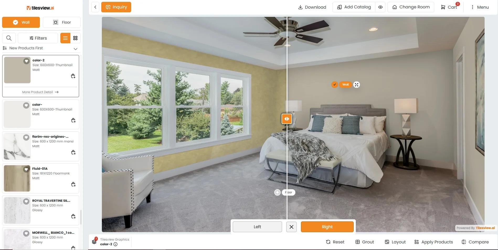
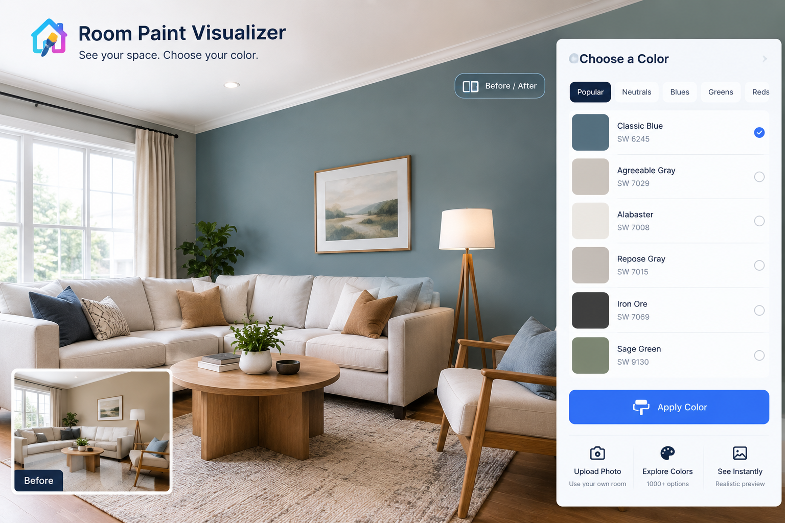
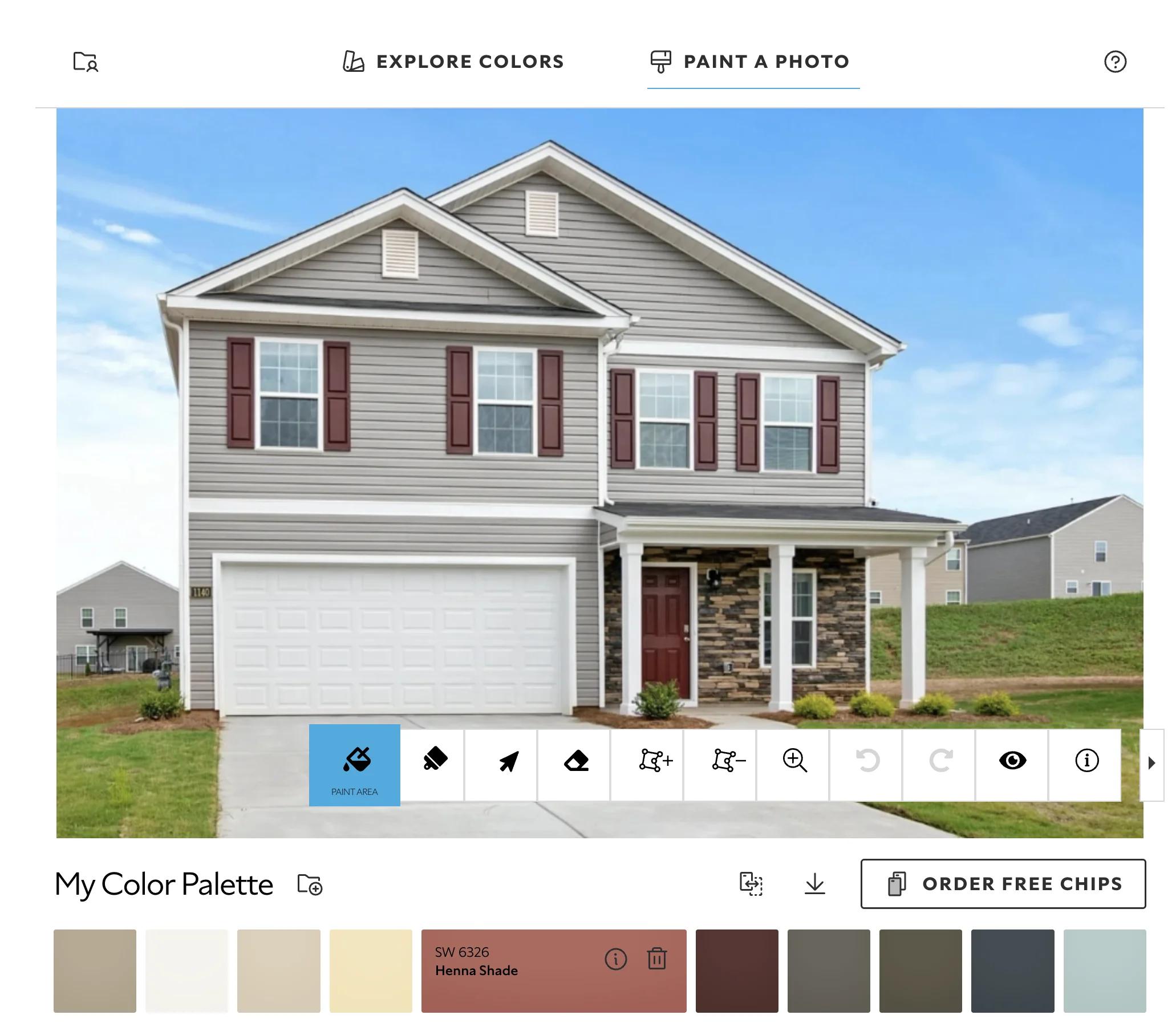
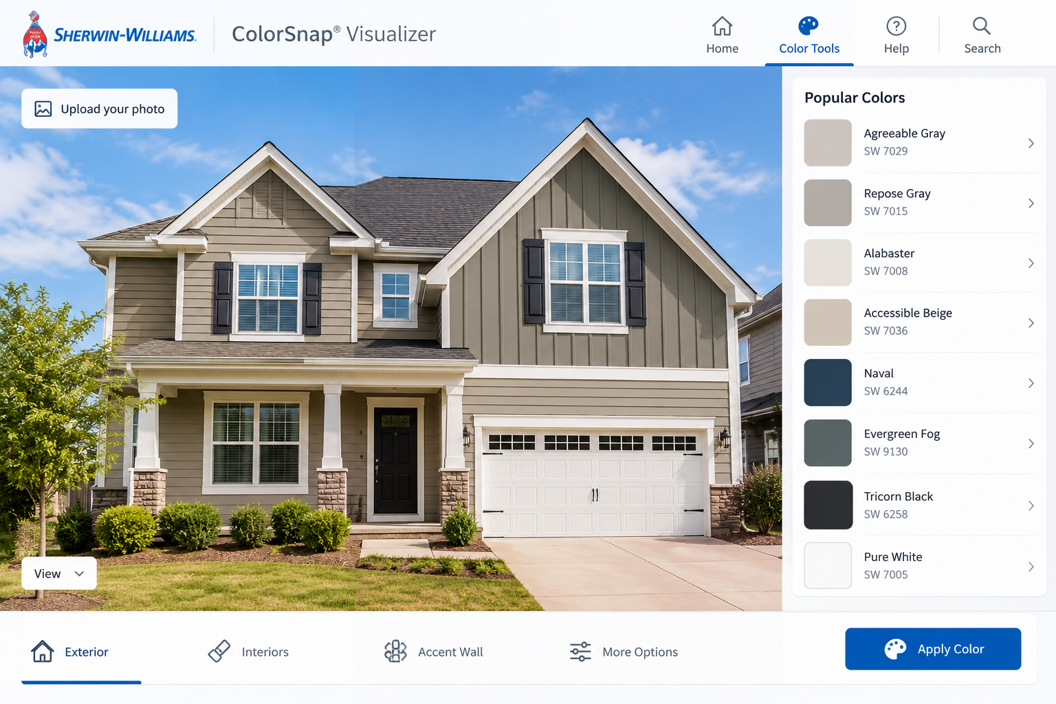
A paint visualizer applies a digital colour to selected areas of a photograph or model. Some tools identify walls automatically; others let you mark the boundaries yourself. This selection process is often called masking.
The result is a design illustration, not a paint specification. It cannot reliably establish coverage, surface preparation or the finished sheen. A flat-looking digital wall may represent anything from matt paint to a washable eggshell finish; the actual product still needs choosing separately.
List the finishes you are not changing: flooring, worktops, tiles, large furniture and visible metalwork. These are the references against which paint must work.
Photograph the room with its usual furnishings in place. Include the floor, a doorway and part of the ceiling rather than filling the frame with one wall. This gives each colour something meaningful to relate to.
Make a short schedule for walls, ceiling, doors, frames, skirting boards and built-in joinery. Beside each, write “keep”, “paint” or “repair first”.
Create an initial preview that changes only the walls. Duplicate it before testing additional surfaces. Otherwise, an appealing all-over scheme can quietly become the assumed brief, even though your original budget covered much less.
Check your tenancy agreement and get any required permission in writing. Approval to repaint walls does not necessarily include doors or fitted cupboards.
Ask whether restoration is required when you leave and whether the landlord can supply the existing paint reference. Include that potential repainting cost in your decision. Keep unapproved surfaces unchanged in the preview so the proposal remains usable.
For a compact room, compare a contrasting trim scheme with one where walls and trim are closer in colour. Reduced contrast can make boundaries less prominent, although it will not compensate for crowded furniture or poor lighting.
In an open-plan home, use views from both sides of a doorway. A colour that works from the sofa may appear abrupt from the kitchen.
In humid conditions, assess ventilation and any signs of damp before choosing coatings. In a hot, bright room, review samples during strong daylight as well as evening light. Digital colour changes do not solve moisture or overheating problems.
If funds are limited, preview a walls-only scheme first. Retaining sound ceiling paint and serviceable trim often leaves more money for necessary repairs and suitable paint.
A photograph-based tool is usually sufficient for a straightforward room. It keeps your furniture and finishes visible, but automatic selections may miss narrow trim or spill colour onto curtains. Correct those edges before judging the composition.
A manually edited image gives better control over doors, ceiling lines and joinery. The tradeoff is time: detailed masking can take longer than the colour comparison itself. It is worthwhile when those boundaries are central to the design.
A colour consultation can help when several fixed finishes disagree or connected rooms need a shared palette. Ask whether the service includes physical samples, product recommendations and a written surface schedule; a rendered image alone is not equivalent to that advice.
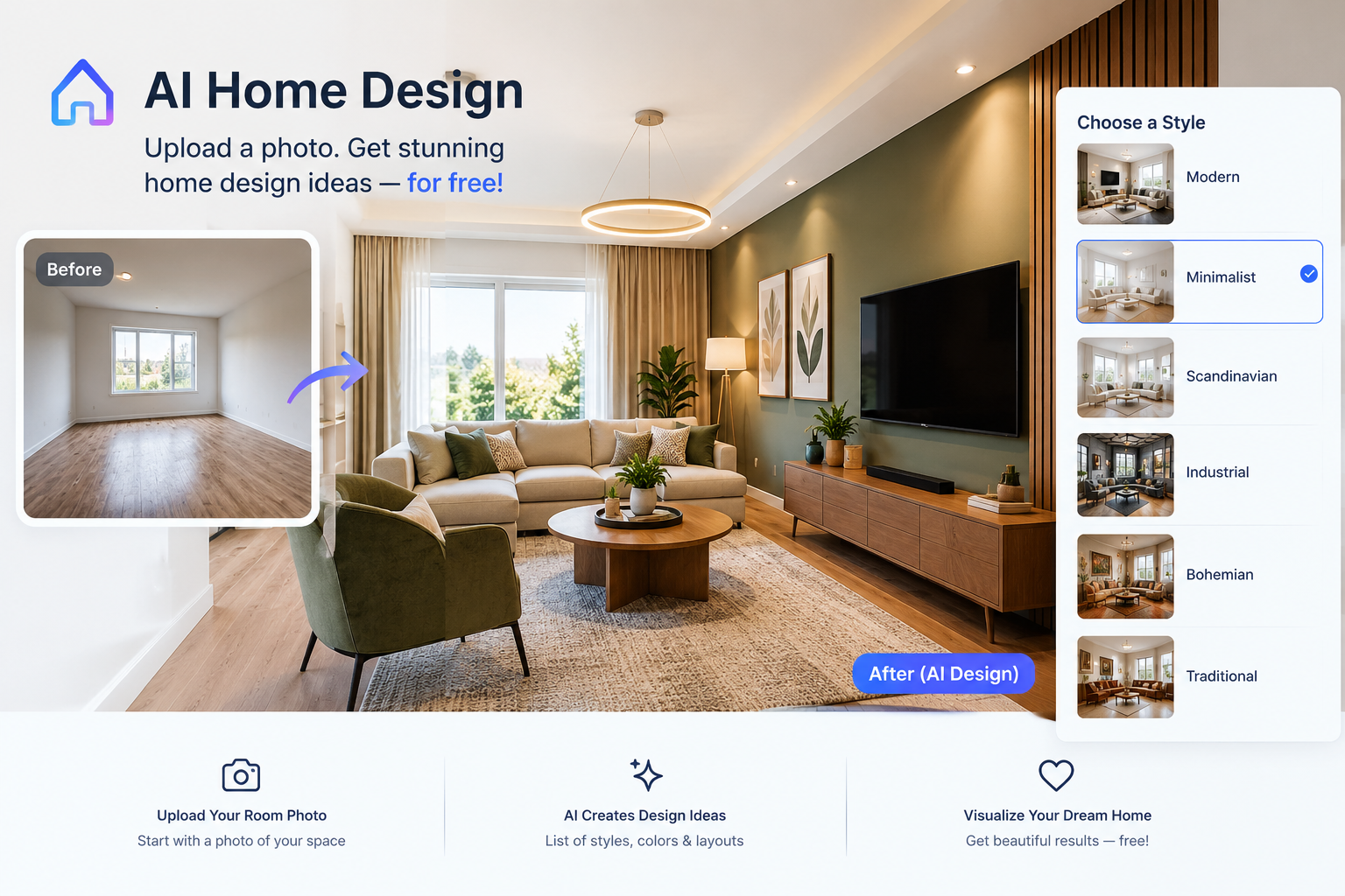
For major alterations, a measured room model may be more appropriate. Treat automated redesign images cautiously if they also change proportions, windows or furniture: those changes can make the proposed paint look more convincing than it would in reality.
One expensive mistake is approving a visual without checking what changed. Darkened window frames, painted radiators and matching cupboard fronts may look like minor details on screen, but each can require a separate preparation method.
Another is treating one selected colour as one universal paint product. Walls, woodwork and metal may need different formulations, even when their colour names match. Differences in sheen and substrate can also affect their appearance.
Before asking for a quote, attach a written schedule:
Do not estimate paint quantities from an image. Measure the surfaces and use the chosen product's coverage guidance, allowing for the substrate and required coats.
Digital colour is affected by the photograph, screen settings and software. Disable night-mode colour shifts when comparing previews, but do not assume that makes the display accurate.
Check physical samples on more than one wall, beside the finishes that will remain. Follow the sample product's drying instructions before judging it.
Investigate damp, recurring mould or significant cracking before decorating. Where older coatings may contain lead or other hazardous materials, avoid sanding or scraping until assessed. Use appropriately licensed or accredited professionals for hazardous-material work and regulated repairs.
Ventilate during painting according to the product instructions. Low odour does not remove the need to follow application and reoccupation guidance.
Start with the largest fixed surface, usually flooring, then check cabinetry, stone and tile. Warm timber does not require warm paint in every case, but the relationship should look intentional. A very cool white can make some cream finishes appear more yellow by comparison.
Use the visualizer to test two approaches: a related palette with gentle differences, and a more deliberate contrast. For example, muted blue-green walls may provide a useful counterpoint to warm timber, while a restrained beige may keep attention on furniture and artwork.
Ceilings and trim deserve separate consideration. A bright white ceiling can look crisp above a strong wall colour, but may feel disconnected from soft, warm walls and aged joinery. Compare a softer white rather than automatically carrying the wall colour overhead.
Small decorative accents are poor starting points if they may soon change. A cushion is easier to replace than a tiled floor.
Begin elsewhere if the room has unresolved leaks, widespread coating failure or surfaces needing substantial repair. Condition determines the practical scope before colour does.
Visualizers are also limited for limewash, metallic coatings, translucent stains and strongly textured finishes. Their character depends on application, movement and reflected light, which a flat overlay cannot reproduce convincingly.
If changing the layout or lighting is already planned, resolve those decisions first. Otherwise, you may be selecting paint for shadows and sightlines that will no longer exist.
For comparison, think in relative levels rather than a universal price per room:
These categories describe scope, not fixed prices. Labour rates, taxes, paint systems and building condition vary considerably by location.
Spend first on identifying defects and confirming the scheme physically. Keep a separate allowance for repairs discovered during preparation. When comparing quotes, check that they cover the same surfaces, protection, preparation and cleanup; the lowest total may simply describe a smaller job.
Save the approved preview alongside the final surface schedule, but record what was actually applied: manufacturer, colour code, product line, sheen and date. Keep labelled leftover paint only under the manufacturer's storage guidance and away from children.
Touch-ups may remain visible because paint ages and application texture differs. On a prominent wall, repainting from corner to corner may give a more consistent result than patching several marks.
Choose cleanability according to use, not the digital appearance. Hallways, kitchens and family rooms need particular attention to the coating's cleaning instructions and curing time.
No. It helps compare relationships and boundaries. Physical samples in the room remain necessary before committing to the full purchase.
Yes, even if it stays unchanged. Its existing colour affects how the proposed walls read, especially with pale schemes.
Some tools allow separate selections. If yours does not, use an editable image or add clear notes to the surface schedule.
Usually not for connected spaces. Include another angle showing doorways and adjoining finishes so you can assess transitions.
It can make boundaries feel closer, but the effect depends on contrast, lighting and furnishings. Compare complete room views, not isolated swatches.
Use it to explain intent, alongside measurements and a surface list. A reliable quote still requires enough information about condition and access.
No. Colour and sheen are separate choices. Confirm both, and check that each product is suitable for its intended surface.
Start with three distinct approaches, then narrow to two for sampling. Numerous near-identical previews often make the decision harder rather than clearer.
Prioritise the properly applied, dried sample in your actual room. Check it at different times before accepting or rejecting the colour.
Not necessarily. Accurate surface selection and a clear written scope are more useful than extra rendering features for a straightforward project.
The most useful paint preview answers two questions: which colours belong together, and exactly which surfaces will change. Carry those decisions into samples, measurements and a written specification rather than stopping at an attractive image.
If you would like to explore the room more broadly, try the DecorAdTechadvice redesign tool to develop an initial direction, then verify the proposed colours and finishes in your home.
Home Painting Visualizer: Choose Colours Before You Paint — Explore how a home painting visualizer can help you compare colors effectively, ensuring your paint choices align with your space's lighting.
Paint My Home Online Free: A Practical No-Cost Plan — Explore how to preview paint colors online for free, helping you refine your choices before using the paint visualizer effectively.
Latest News Decorator advice.com: Test a Room Before Renovating — Explore how testing paint and materials in one room can streamline your decision-making process before using the paint visualizer.
Blueprint AI: A Practical Guide to Planning Your Room — Explore how Blueprint AI can help you visualize room layouts and optimize space before finalizing your paint choices and requests.
latest decoratoradvice .com: Design Around What You Already Own — Explore how to design around your existing furniture by coordinating colors and materials, ensuring your paint choices complement your current decor.